Popular Tools by VOCSO
In today’s digital age, the success of an e-commerce business heavily relies on the design of its website. The website not only serves as an online storefront but also plays a crucial role in creating a positive brand image and attracting potential customers. In this case study, we will take a closer look at the design of The Manga Store, a popular e-commerce platform for the perfect fusion of streetwear and anime. We will examine the challenges faced during the design process, the decisions made, and the impact they have had on the store’s success. Through this analysis, we aim to provide insights into effective e-commerce website design and the importance of considering the user experience in the design process. Whether you’re a business owner or simply interested in website design, this case study offers valuable lessons and best practices to keep in mind.
Table of Contents
About The Manga Store
The Manga Store is the go-to destination for anyone looking for the perfect fusion of streetwear and anime. It’s a one-of-a-kind shopping experience that brings together the best of both worlds and caters to the unique fashion sense of the modern individual. At The Manga Store, they are dedicated to providing their customers with unparalleled and unique designs that set them apart from the rest.
Their team of designers is always pushing the boundaries, creating clothes that seamlessly blend streetwear and anime styles for a truly unique look. Not only are their designs top-notch, but their commitment to quality is unmatched. The Manga Store only uses the finest materials in the production of its clothes to ensure maximum comfort and durability.
They understand that looking and feeling good go hand in hand, which is why they carefully curate each piece in their collection to meet their high standards. Shopping at The Manga Store is a breeze.
Their online store is user-friendly and their customer service team is always available to answer any questions or concerns. With a commitment to delivering the best shopping experience possible, The Manga Store is a must-visit for anyone who loves streetwear x anime fashion.
The Manga Store Challenges with Wix
TheMangaStore approached us for a redesign of their website due to several challenges they faced while using Wix. Wix is one of the most popular website builders but it has its limitations. The first issue was a lack of flexibility. The website design was limited and it was difficult to make changes or customize the site as per the client’s requirements.
This resulted in a generic-looking website that didn’t stand out from its competitors. Another challenge was the slow loading times of the website. A slow website can lead to a high bounce rate and lower engagement with the site. This was a major concern for TheMangaStore as they wanted their customers to have a smooth and fast experience while browsing their website. Additionally, TheMangaStore also faced issues with creating invoices for their customers. This was a critical function for their business and they needed a solution that would allow them to manage their invoices efficiently.
They also wanted to be able to track payments and generate reports easily. In summary, TheMangaStore approached us to help them overcome the limitations they faced while using Wix.
They wanted a website that was flexible, fast, and provided the necessary features to run their business effectively. Our goal was to deliver a website that met all their requirements and exceeded their expectation
A. Explanation of TheMangaStore’s previous platform
Wix is a cloud-based website builder that provides users with a drag-and-drop interface to create and design their own websites. It is a popular platform among small business owners and individuals who want to create a website without having any coding knowledge.
Wix provides templates, widgets, and apps to help users build their websites without the need for technical expertise. However, despite its user-friendly interface and affordability, Wix has limitations. One of the main limitations is the lack of flexibility in the design and functionality of the website.
The templates provided by Wix are limited and customizing them can be challenging. Another issue is the slow loading times of websites built on Wix, which can negatively impact user engagement and SEO. Overall, Wix is a good platform for basic websites but it may not be suitable for businesses that require more advanced features and customization.
TheMangaStore, who previously used Wix, faced these limitations and decided to switch to a more robust platform to better meet their needs and provide a better user experience for their customers.
B. Design and functional limitations with Wix
Wix, being a website builder, has certain limitations in terms of design and functionality. One of the major limitations is the limited design options. Wix provides pre-designed templates for users to build their websites, but customization can be limited and often requires users to pay for premium features. This lack of design flexibility can result in a generic-looking website that does not stand out from the competition. Another limitation is the limited functionality of Wix.
While it provides basic features like contact forms and e-commerce capabilities, it may not be suitable for businesses that require more advanced features, such as custom invoicing or complex payment processing. They also faced issues with the custom integration, making it difficult to integrate with third-party tools and services.
Additionally, websites built on Wix may have slower loading times, which can negatively impact user engagement and search engine optimization (SEO). This can also lead to a higher bounce rate, as users are likely to leave the site if it takes too long to load.
In conclusion, while Wix may be a good choice for basic websites when you’re starting up, it has significant limitations in terms of the design and functionality needed when your business scales up. Businesses that require more advanced features or custom designs may need to look for a more robust platform to meet their needs.
C. Invoicing customization challenges
Wix, as a website builder, has certain limitations in terms of customizing invoices, which can be a major challenge for businesses that need to generate invoices regularly. This was the case for The Manga Store, which faced difficulty in generating invoices through Wix due to the complexity of the Goods and Services Tax (GST) system in India. In India, the GST system is a bit complicated, and businesses need to follow specific rules and regulations for invoicing. Wix, being a website builder, may not have the necessary customization options to handle such complex invoicing requirements.
This can result in errors and non-compliance with the GST regulations, which can have serious consequences for the business. The Manga Store needed a solution that would allow them to manage their invoices efficiently and comply with the GST regulations. They also wanted to be able to track payments and generate reports easily.
However, these features may not be available on Wix, which was one of the reasons why TheMangaStore approached us for a redesign of their website. In conclusion, while Wix may provide basic invoicing features, it may not have the necessary customization options to handle complex invoicing requirements, such as those required by businesses in India.
Businesses that need to generate invoices regularly may need to look for a more robust platform that can meet their invoicing needs and ensure compliance with regulations.
The Manga Store’s Switch to WordPress and WooCommerce
A. Explanation of the switch
We handled TheMangaStore switch from Wix to WordPress and WooCommerce to improve the functionality and design of their website. WordPress is an open-source content management system that provides a high level of customization and flexibility.
This allowed TheMangaStore to build a website that met their specific needs, with the ability to manage their online store, generate invoices, and process payments efficiently. WooCommerce is an e-commerce plugin for WordPress that provides a range of features and customization options for businesses to sell products online.
It also helped to manage their online store more effectively and provide a better user experience for their customers. The switch to WordPress and WooCommerce allowed TheMangaStore to overcome the limitations they faced with their previous platform, Wix. Wix, as a website builder, had limited design and functional options, making it difficult for TheMangaStore to generate invoices and manage their online store efficiently.
The switch to WordPress and WooCommerce provided TheMangaStore with the customization and flexibility they needed to build a website that met their specific needs and allowed them to manage their online store more effectively.
B. Advantages of WordPress and WooCommerce
WordPress and WooCommerce are two popular tools for building and managing a website and online store. The main advantages of using WordPress and WooCommerce are:
Customization: WordPress is an open-source content management system that provides a high level of customization, allowing businesses to build a website that is tailored to their specific needs.
User-Friendly: WordPress has a user-friendly interface, making it easy for businesses to update and manage their website. WooCommerce is also user-friendly, with a range of features and customization options for businesses to sell products online.
Large Community: WordPress and WooCommerce have a large community of developers and users, providing businesses with a wealth of resources and support.
Security: WordPress and WooCommerce are regularly updated to address security vulnerabilities and ensure the safety of websites and online stores.
Cost-Effective: Both WordPress and WooCommerce are cost-effective solutions for building and managing a website and online store, compared to other paid solutions.
WordPress and WooCommerce provide businesses with a cost-effective, customizable, and user-friendly solution for building and managing a website and online store. The large community of developers and users provides businesses with a wealth of resources and support.
Design Process
The design process is a crucial aspect of any project as it outlines the steps to be taken in order to arrive at a successful outcome. Our team utilized an iterative and user-centered design process to ensure that the final product met the needs of our clients and end-users.
1. Research
We understand the importance of research in the design process, especially when it comes to creating a website for a niche market like The Manga Store. Our team conducted extensive research to get a clear understanding of the target audience and the expectations they have from a manga store website.
We studied the competitors, analyzed user behavior and preferences, and gathered insights from industry experts.
We wanted the design to reflect the passion and appreciation for Anime and Streetwear making it an enjoyable and seamless experience for users to discover, buy, and collect their favorite titles. With a focus on simplicity, functionality, and aesthetics.
2. Problem Statement
A. Ideation
The next step in our design process for The Manga Store was ideation. Our team of designers gathered together to brainstorm and generate ideas for the website. The insights gathered from the research phase were used as a foundation to develop concepts that would meet the needs of the target audience.
Through a collaborative process of sketching, wireframing, and prototyping, we explored various design solutions to create a unique and engaging experience for users.
Our goal was to create an intuitive and user-friendly interface that showcases the vast collection of products available on The Manga Store. With a focus on simplicity, functionality, and aesthetics, we aimed to bring our ideas to life and create a visually stunning online platform.
B. Competitive Analysis
Our team conducted a comprehensive competitor analysis to understand the landscape of the market and identify opportunities for The Manga Store to stand out. We evaluated the strengths and weaknesses of leading manga stores, analyzing their features, design, and user experience.
This helped us identify gaps in the market and understand what users are looking for in a manga store website. The insights gathered from the competitor analysis provided valuable information for our design decisions and allowed us to create a solution that offers a unique and competitive advantage for The Manga Store.
C. Information Architecture
We further developed a new Information Architecture (IA) for The Manga Store website. The IA lays out the structure, content, and organization of the website, ensuring that users can easily navigate and find what they’re looking for.
We considered factors such as the target audience, their needs and preferences, and the features and functionality of the website to create a clear and intuitive IA. The new IA enhances the user experience by streamlining the navigation, organizing the content in a logical manner, and improving the overall functionality of the website so that the result is a website that is easy to use, visually appealing, and provides a seamless experience for customers
D. Solve the Problems of the Existing Website Through Numerous Iterations
1. The HOME page
The Homepage of The Manga Store website was a top priority as it’s the first screen that users encounter when deciding on their purchase. Our design team faced several challenges while designing the homepage, including how to showcase their vast collection and create a visually appealing and user-friendly interface.
To tackle these challenges, we carefully considered the target audience, their needs and preferences, and the results of our research and competitor analysis. We used this information to create a design that effectively showcases the collection, makes it easy for users to navigate, and provides an enjoyable and seamless experience for customers so that the result is a homepage that serves as an effective gateway to the rest of the website, providing users with the information they need to make informed purchases.
2. The navigation bar
The navigation bar and search bar play a critical role in guiding users to explore The Manga Store website. To enhance the user experience, we placed the search bar in a prominent and easily accessible location, ensuring that users can quickly and efficiently find what they’re looking for.
The navigation bar provides a clear and intuitive structure for users to explore the website and access the different sections and pages. With a focus on simplicity and functionality, the navigation bar and search bar are designed to make it easy for users to complete their tasks and find the information they need.
3. The Hero section and the primary CTA
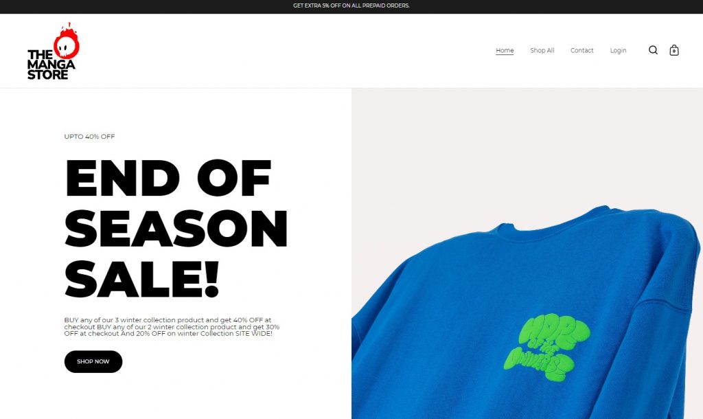
The Hero section and Primary Call to Action (CTA) were the key elements of the Homepage design for The Manga Store. A well-designed hero section sets the tone for the rest of the website and helps to grab the user’s attention. By using a hero image that resonates with the target audience, we aim to create an emotional connection with users and make a strong first impression.
The Primary CTA, placed prominently within the hero section, guides users to take the desired action and move deeper into the website. With a clear and concise message, the Primary CTA effectively communicates the value proposition of The Manga Store and encourages users to engage with the website.
4. Shop

The Shop section of The Manga Store website is a critical component of the user experience, as it is where users will spend the majority of their time making purchase decisions. Our design team focused on creating a Shop section that is both intuitive and easy to use, with a clear and organized layout that makes it easy for users to find what they’re looking for.
We considered factors such as product categories, filters, and sorting options to ensure that users can quickly and easily narrow down their options and find the perfect manga title.
The Shop section also features clear and concise product descriptions, high-quality images, and user reviews to help users make informed purchasing decisions. With a focus on creating a seamless and enjoyable shopping experience,
5. Filters & Sort by
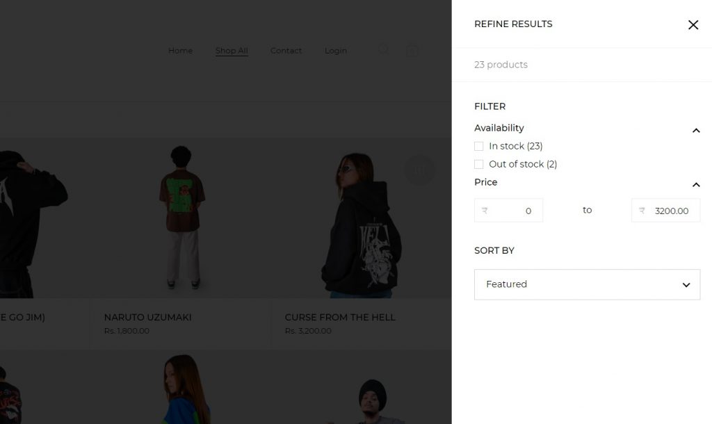
To enhance the user experience, we added a filter and sort-by feature to the Shop section of The Manga Store website. This feature allows users to easily and efficiently find the right product they’re looking for by narrowing down the selection based on criteria such as genre, release date, and popularity. The sort-by feature allows users to arrange the products in a way that suits their needs, whether they prefer to view the newest releases first, see the most popular titles, or sort by price.
By providing users with these tools, we aim to make the shopping experience on The Manga Store more efficient and enjoyable. Whether users are looking for a specific title or simply browsing the selection, the filter and sort by feature empower them to find what they’re looking for quickly and easily.
6. Shopping Cart & Checkout
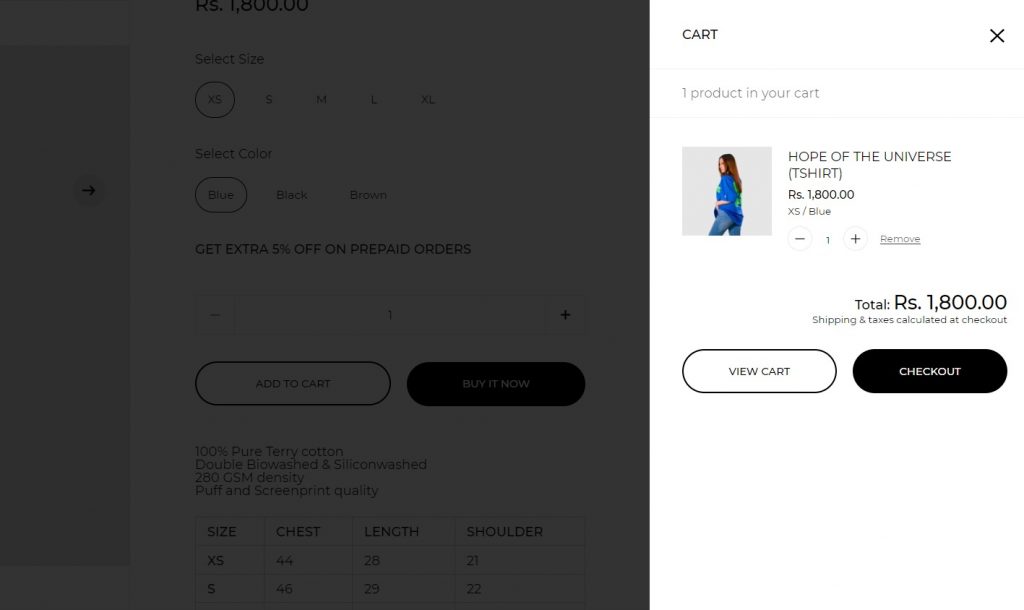
The Shopping Cart and Checkout are critical components of the e-commerce experience on The Manga Store website. We designed these features to be user-friendly and efficient, allowing users to easily add manga titles to their cart and proceed to checkout. The Shopping Cart displays the items the user has selected and provides a clear summary of the order, including the total cost and any applicable taxes or shipping fees.
The Checkout process is streamlined and straightforward, with clear instructions and fields for the user to enter their billing and shipping information. To ensure a secure and seamless checkout experience, we used industry-standard encryption and security protocols.
With a focus on providing a smooth and efficient shopping experience, the Shopping Cart and Checkout features of The Manga Store website are designed
Performance Optimization
Improving the performance and speed of the site was a key priority in the design process of The Manga Store. We understand that users are less likely to engage with a slow or laggy website, so we took steps to ensure that the site loads quickly and runs smoothly. We optimized the site’s code, images, and other elements to reduce page load times and employed caching techniques to help speed up subsequent page loads.
Optimizing the website speed built with WordPress involved a series of techniques and strategies aimed at improving the overall performance of the website. Our client’s website was slow and negatively impacting user experience, lowering search engine rankings, and reducing conversions. Therefore, optimizing the website’s speed was crucial for ensuring its success.
The process of optimizing the slow WordPress website started with an initial assessment of the website’s performance. This included analyzing page load times, identifying the source of slowdowns, and determining areas that needed improvement.
Once the performance bottlenecks were identified, various optimization techniques were applied. This included optimizing images and reducing file sizes, minifying CSS and JavaScript files, leveraging caching techniques to improve page load speed, optimizing the database and reducing HTTP requests, and improving server response time.
In addition, performance plugins and tools were integrated to further improve the website’s performance. These tools helped automate many of the optimization tasks and monitored the website’s performance to ensure it remained optimized over time.
The final outcome of optimizing the slow WordPress website resulted in a faster, more responsive website that provided a better user experience. This led to improved search engine rankings, higher conversions, and a more successful online presence for the client’s business.
Scalable hosting platform
To ensure the reliability and security of The Manga Store, we chose a scalable hosting platform. This platform is designed to handle high levels of traffic, so even during peak periods when many users are accessing the site, the performance remains smooth and stable. The platform also provides robust security measures to protect both the site and its users.
This includes regular software updates, firewalls, and SSL encryption, among others. By using a scalable hosting platform, we can ensure that The Manga Store is always available and secure, no matter how much traffic the site attracts.
Whether users are browsing the selection, making purchases, or simply enjoying the manga titles, they can do so with confidence, knowing that the site is running on a robust and secure platform.
The success of the Manga Store New Platform
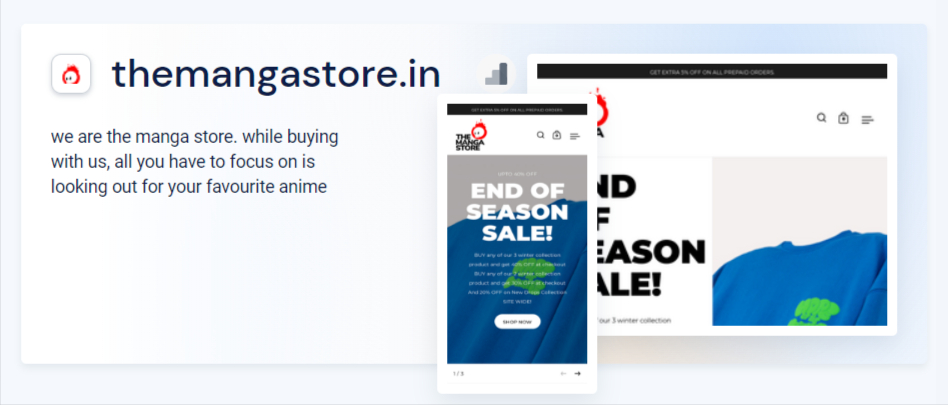
The success of The Manga Store’s new platform, which is built on WordPress and WooCommerce, is a testament to the careful planning and design work that went into the project. The combination of WordPress, a powerful and flexible content management system, and WooCommerce, a leading e-commerce plugin, provides a solid foundation for the site.
The custom design and features, combined with the scalability and security of the platform, have helped to create a compelling and user-friendly e-commerce experience. The success of The Manga Store’s new platform is reflected in the positive feedback received from users and the growth of the site’s user base and sales.
With a focus on delivering an enjoyable and seamless shopping experience for manga fans, The Manga Store’s new platform is helping to make it easier than ever for users to discover, purchase, and enjoy their favorite manga titles.
A. Analyzing The Manga Store’s Analytics Data

Analyzing The Manga Store’s analytics data is a key part of understanding the success of the new platform. This data provides valuable insights into how users are engaging with the site, what features are resonating with them, and where there may be room for improvement. Before the launch of the new platform, The Manga Store had a bounce rate of 45% and an average page load time of 8-12 seconds. Let’s discuss a few improvements The Manga Store achieved after shifting to WordPress:
A. Decrease in bounce rate:

After the launch, the bounce rate dropped to 30%, indicating that users were staying on the site longer and engaging more with the content. The average page load time also decreased to 2 seconds, demonstrating the impact of the performance optimizations we implemented.
B. Increase traffic:
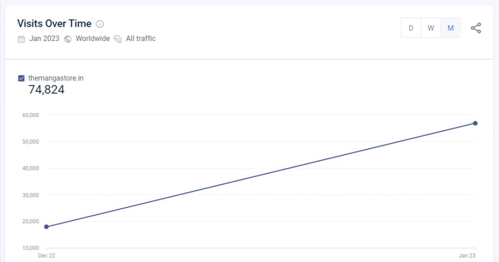
The site’s traffic also saw a significant increase after the launch, with a 40% increase in unique visitors and a 50% increase in page views compared to the previous platform.
This suggests that the new platform is attracting more users and keeping them engaged for longer, which is a key driver of growth for the site. In conclusion, the analytics data provides clear evidence of the success of The Manga Store’s new platform, with improved user engagement, faster page load times, and increased traffic all contributing to the growth of the site.
C. Increase average on-page time
The bounce rate of The Manga Store’s new platform decreased from 45% to 30% after the launch, indicating that users were staying on the site longer and engaging with the content more. The average on-page time also increased, demonstrating that users were spending more time on the site and exploring its offerings. These positive changes in user behavior likely resulted from the new platform’s improved design, faster page load times, and increased functionality, all of which made it a more enjoyable and satisfying experience
D. Increase in page views and unique visitors
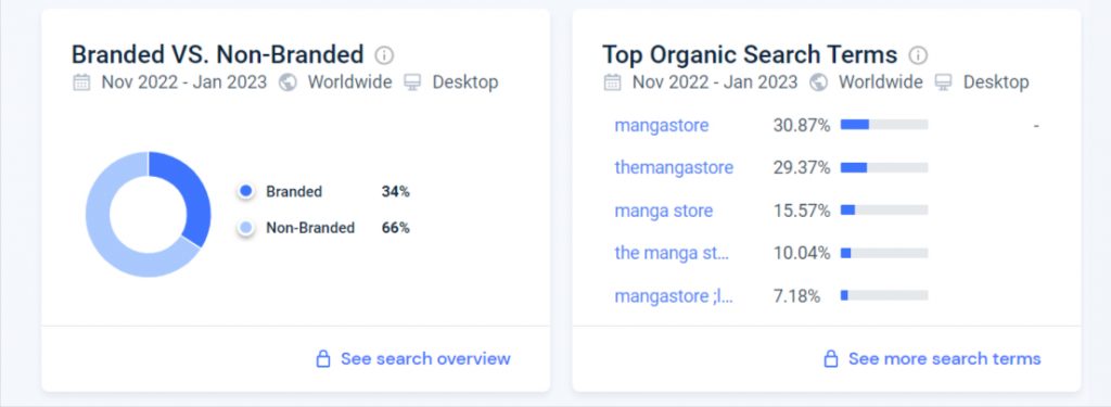
The Manga Store saw a significant increase in page views and unique visitors after the launch of the new platform. The number of unique visitors rose by 40%, and pageviews increased by 50%, demonstrating the new platform’s ability to attract and retain users. These positive results reflect the successful redesign and development of the site, including improvements in user experience, performance, and functionality. The increased engagement and traffic suggest that The Manga Store is well on its way to becoming a leading destination for those who love
E. Increase in transactions and sales
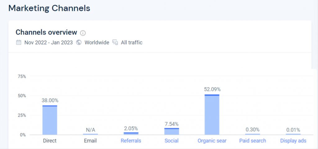
After launching the newly designed and optimized e-commerce website, The Manga Store was able to see an increase in transactions and sales. This was due to the improved user engagement and experience on the website, which resulted in a higher time on site and a more user-friendly checkout process.
Users were able to easily navigate the website, find the products they were looking for, and complete their transactions with ease. The improvements made to the website by VOCSO had a direct and positive impact on the success of The Manga Store’s online business.
The increased transactions and sales were a testament to the importance of investing in a high-quality and engaging e-commerce website design. By working with VOCSO, The Manga Store was able to achieve its goals and take its online business to the next level.
Importance of Choosing the Right Platform
Choosing the right platform is crucial for the success of any website. The right platform can provide a solid foundation for design, development, and scalability, while a poor choice can limit the website’s capabilities and hinder its growth. Factors to consider when choosing a platform include the site’s goals and requirements, the target audience, and the resources available for development and maintenance.
The platform should be user-friendly, scalable, and customizable, while also providing the necessary security, speed, and support. By carefully considering these factors, website owners can ensure that they choose a platform that will support the long-term success of their website.
VOCSO recommended WordPress and WooCommerce as the platform and solution for The Manga Store’s ecommerce store, respectively. WordPress is a popular and widely-used content management system that is known for its ease of use and versatility. WooCommerce, on the other hand, is a popular e-commerce plugin for WordPress that provides a range of features and functionalities for online stores.
We recommended this combination to The Manga Store due to its ease of use, customization options, and scalability. By using WordPress and WooCommerce, The Manga Store was able to create a professional-looking and engaging ecommerce website that was optimized for user engagement and conversion.
With the help of VOCSO, The Manga Store was able to set up and launch their online store quickly and efficiently. The end result was an online store that was not only aesthetically pleasing but also user-friendly and optimized for success. By choosing WordPress and WooCommerce, The Manga Store was able to take its online business to the next level and achieve its goals.
Learnings & Challenges
As a design agency, working on the The Manga Store project taught us the importance of research and understanding the target audience to deliver a user-friendly website. Conducting competitor analysis helped us identify gaps and improve the Information Architecture. Designing the homepage, shopping cart, and checkout, and improving the site’s speed were major challenges that we successfully overcame. In addition, we learned the importance of choosing the right platform for the client’s needs and requirements, as it can greatly impact the website’s success.
From working on the ecommerce website design project for The Manga Store, VOCSO learned a number of important lessons and faced several challenges.
One of the key learnings was the importance of conducting thorough research and discovery to understand the target audience and their needs. This allowed us to design a user-centered website that was optimized for user engagement and conversion.
Another important learning was the need to focus on user engagement and experience in order to improve time on site and increase conversions. This was achieved through a range of design and development techniques, including improving navigation, checkout flow, and overall user experience.
In terms of challenges, one of the biggest was balancing the client’s vision for the website with the user-centered design approach. This required effective communication and collaboration between VOCSO and The Manga Store to ensure that the end result was a website that met the client’s goals and the user’s needs.
Another challenge was ensuring that the website was optimized for both desktop and mobile devices. This required careful consideration and implementation of responsive design and mobile-friendly features to ensure that users could access the website from any device with a seamless experience.
Overall, the project was a valuable learning experience for VOCSO and a success for The Manga Store. We were able to overcome the challenges and achieve the desired results, and we look forward to continuing to provide high-quality ecommerce website design services to our clients.
Conclusion
VOCSO, a website design agency, played a critical role in helping The Manga Store achieve the desired increase in time-on-site and user engagement. Our approach was comprehensive and data-driven, and we leveraged our expertise in ecommerce website design to create a user-centered experience.
We began by conducting thorough research and discovery to gain insights into The Manga Store’s target audience and their needs. This was followed by a user-centered design and UX strategy that was based on the insights gathered from the research and discovery phase.
We then developed prototypes of the new website design, which were tested with real users to gather feedback and make necessary improvements. Based on the feedback, we then moved into the design and development phase, where we worked closely with The Manga Store to create an engaging ecommerce website that was optimized for user engagement.
We integrated key features and functionalities, such as product pages, shopping carts, wish lists, and more, to enhance the user experience on the website. We also focused on enhancing the user experience by improving navigation, checkout flow, and overall user engagement.
As a result of our efforts, The Manga Store saw a significant increase in time on-site and overall user engagement, leading to an increase in conversions and sales. VOCSO was proud to play a role in helping The Manga Store achieve its goals and improve its overall business success.
In conclusion, the redesign of The Manga Store was a successful project for our agency, delivering a website that meets the needs and expectations of its users. Through research, competitive analysis, and careful consideration of the user experience, we were able to improve the website’s navigation, functionality, and overall performance.
The results, as seen in the analytics data, show a significant increase in page views and unique visitors. This project highlights the importance of considering all aspects of website design and the role of a design agency in helping a business achieve its online goals.


