Popular Tools by VOCSO
Since the advent of internet and online reading facilities, the requirement of web content has increased enormously. Further, it has become the key to build up your target audience. With this expanding content market, creating a constant audience base is a difficult task. This is mainly because though anyone can attempt writing stories, articles and blogs, not everyone has the ability to engage readers for long. For every writer, creating an engaging content is one the most daunting task. In an already crowded online marketplace, creating content full of web design is the way to stand out and be remarkable. However, one doesn’t need to write similar to that of William Shakespeare to engage readers. Earlier, content only used to mean communicating through text. With the evolving generation of audience, the definition seems to be changing. Content now essentially means effective communication through not only text but enhanced pictures and graphics. Still, typography plays a major role in creating a brand value for your website.
There are various smaller but really valuable points which one has to take care of to provide high quality typography in web design. Some of these include the need to have proper font size, shape, color, width of text, spacing between lines and the amount of blank spaces spread over a worksheet among many other parameters. To help web designers create an remarkable design, we provide you with some of the major pointers.
Table of Contents
Key Pointers to Craft GOOD Quality Typography in Web Design
For any brand, creating designs and typography in web design which are visually appealing to customers is the prerequisite for their reputation. This is mainly because users are drawn toward that content which is pleasing to eye, easy to ready and does not have any distraction. Besides, website which are typographically more perfect helps in creating an emotional connect with the users. To attain the same, below pointers needs to be carefully adhered to.
Tip 1: Standardised Font Type For Continued Engagement
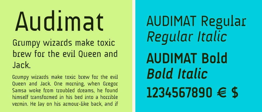
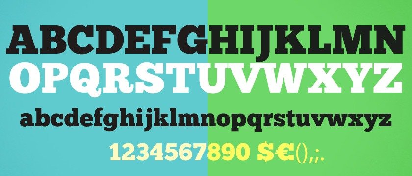
While writing and web designing, it is advisable to use standardized text with an appropriate font size. The reason behind this is that readers are familiar reading some standard type of font like Arial, Calibri, Times New Roman. These fonts are utilitarian and has the power to engage readers for a long time. By using fonts which are not conventional might dissuade the audience from reading. Moreover, it will draw more attention towards the formatting rather than the content. Unless otherwise specifically mentioned, a web designer can avoid using a different and unknown font as this will do more harm than a badly written article. See some of the best fonts below:
AUdimat Font
ChunkFive Font
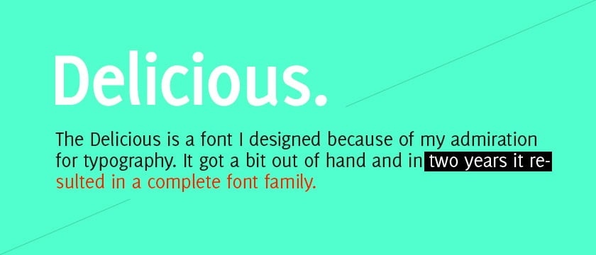
Delicious Font
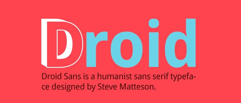
Droid Sans Font
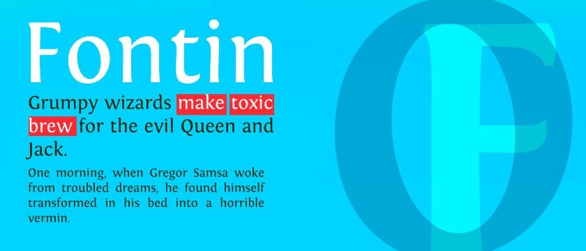
Fontin Font
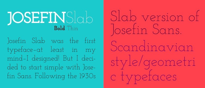
Josefin Slab Font
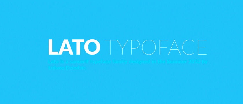
Lato Font
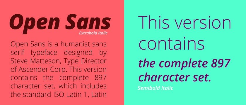
Open Sans Font
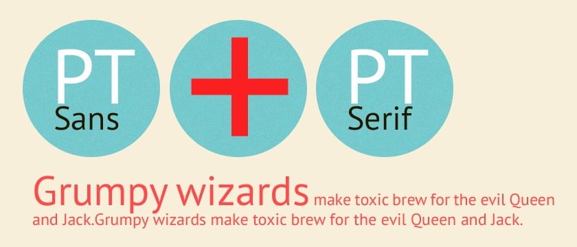
PT Sans and PT Serif
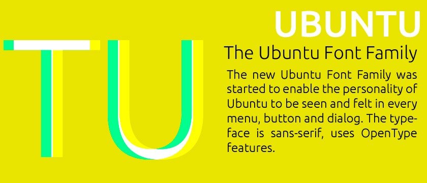
Ubuntu Font
Tip 2: Font Size Matters A Lot
Another key point to note is that, size of the font conveys a particular feeling. Sizing does make a difference to readability. For instance, writing in capital letters signifies that the person is shouting and wants to emphasis something. Then again, too Short and too large a text font leads to frustration. For a web designer, the ideal size to choose can be;
Body Text: Minimum 10
pt – Maximum 12 pt·
Chapter Heading:
Minimum 14 pt – Maximum 16 pt·
Subtitles: Minimum 12
pt – Maximum 14 pt
Despite these ideal figures, some genres of writing go together with a particular font. For instance, a smaller font is mostly preferable for intellectual books thereby conveying seriousness and concentration. Nonetheless, an even smaller size will go in tandem with a classic novel.
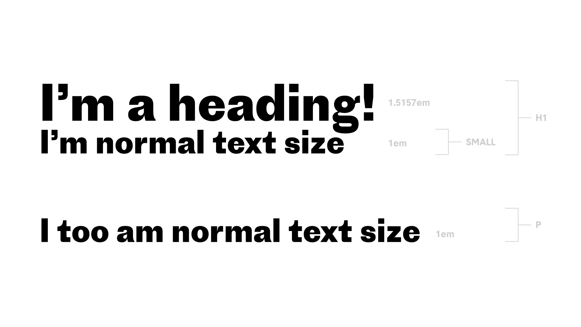
Age of the reader is also other criteria to decide about the font size. Young children often prefer reading books and texts with bigger fonts. Therefore, it is always advisable to consider the readership before choosing a particular font.
Tip 3: Too Many Fonts – A Big No!
Step up your design game by using fewer typefaces. But how many fonts actually count for too many. A major point to watch out for here is that using too many types of font in a single paragraph or page creates confusion and distract the readers. Moreover, it makes the text look messy and scattered all over the place. We always recommend to choose only two kinds of fonts, one for the body and one for the heading. This will give the required consistency to the text. However, this doesn’t mean that you can’t use many typefaces unless you are too sure where and how to use them. Choosing typefaces that blend well such as fonts from the same font family gives a great impression about multiple long page texts.

Many newspaper publications stick to Times New Roman font which is softer to look at and very professional. Had they used too many fonts, this might come across as playful.
Tip 4: Line Limit
Limiting the length of a sentence or line, improves its readability and makes more sense. Even if we look at code style guideline for a language, one can find the rule of not exceeding the line length to more than 60 characters.
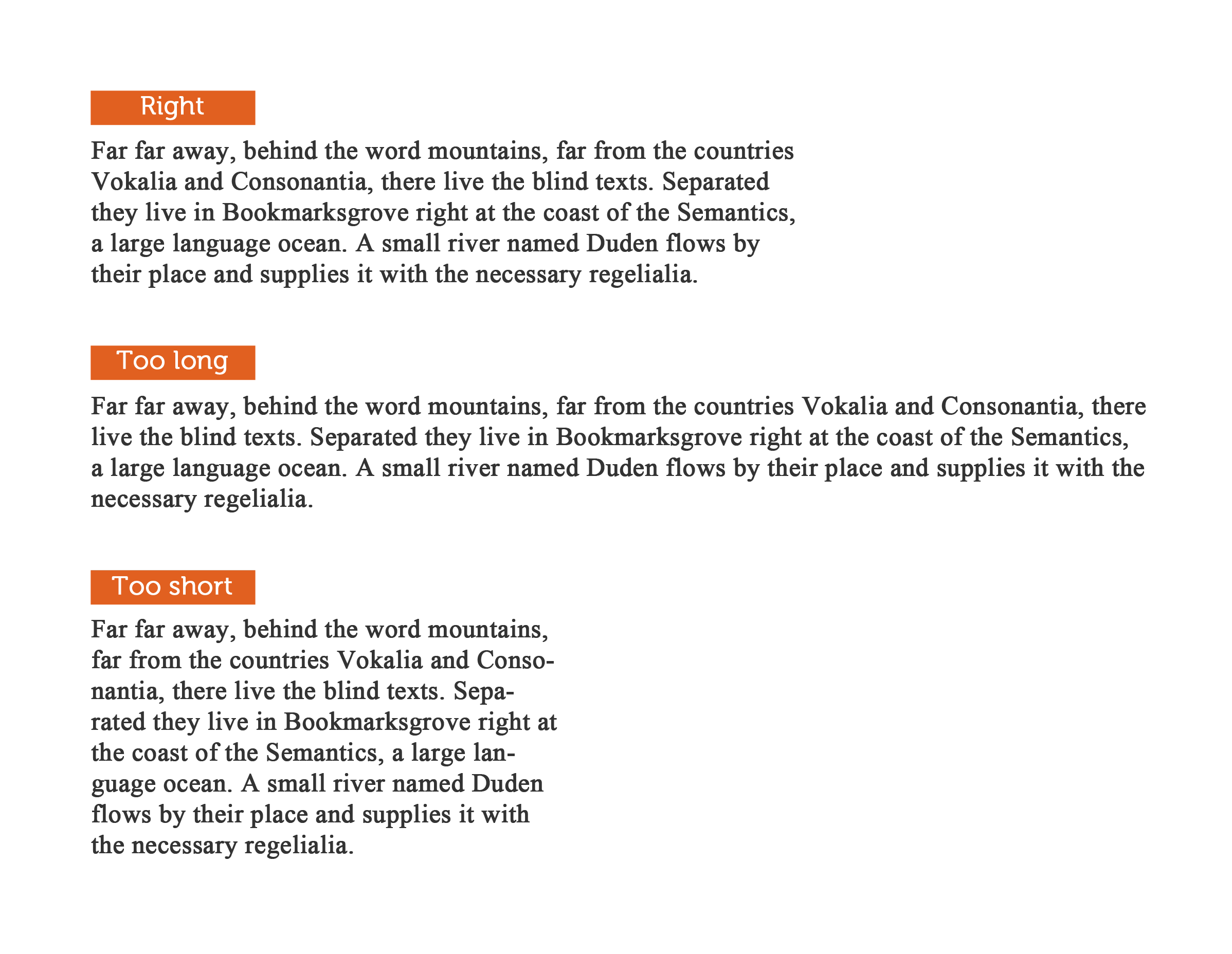
So, what happens if the line length is too long, the readers will have a hard time focusing on the text. If we use shorter sentences, our subconscious mind is energized and fresh to read the next line. Sometime, reading larger sentences often misconstrue the meaning of the sentence. This is also one of the bigger concerns. Besides, the readers will have to go back and forth too often which will break the rhythm.
Tip 5: Consider the X-height factor
To make the content appealing to eyes, a web designer needs to wary of the fact that x-height factor between different fonts needs to be optimum. As users might access the websites through various mediums having different screen size like mobile phones or desktops or tablets.
So, it is important for the web designer to choose the font that will blend well with any type of screen. By ensuring that the font we choose will be compatible for a smaller screen will be easier to read. Fonts which are curved or too much italicized are difficult to understand and read. One cannot make out the difference between the individual letters.
Tip 6: Distinguishable Glyphs
There is always a query about the serifs or sans serif which can be used to make the text look appealing and letters are distinguishable. This decision is based on several key points regarding the project at hand. Once the decision is made, the typeface search will be narrowed down considerably. Though, serifs are historically considered decorative, they might be used for a higher purpose.
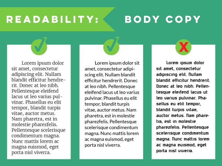
They help increase readability of long texts and passages as the eye gets accustomed to the line that these serif letters make. Moreover, some fonts create illusions and make two letters look similar. For instance, in particular font, a looks like o and I looks like l. Therefore, proper distinction between letter is helpful in reading the words accurately and this would not distort the meaning.
Tip 7: Visual hierarchy with Typography
Scales can be used to show hierarchy on the body. Visual hierarchy is an important part of a web design. This informs the reader about important parts of the text and where to gauge the needed information. This can majorly be seen in magazines where some text is smaller while the other bigger with bigger pictures. Hierarchy is important because it will help the designer determine which text he wants the reader to read first. Creating hierarchy is equally important to readers as it will help them know which part is important, thus making reading much easier.

Tip 8: Correct Alignment
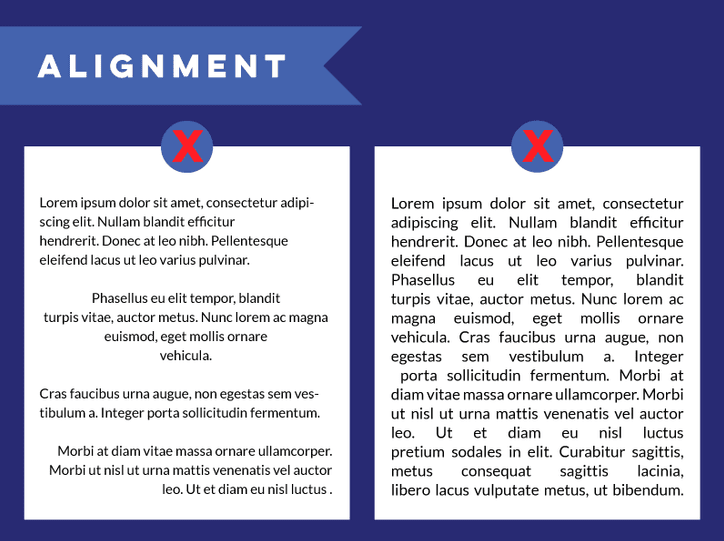
Alignment of the text also play a key role in presenting your web page. Based on the type of content, alignment has to be changed accordingly. For instance, while writing a letter, we start from the left-hand margin and avoid using the middle alignment. The middle alignments can be used for subjects and headings of paragraphs which are not interconnected.
Tip 9: White Space Between Header and Body
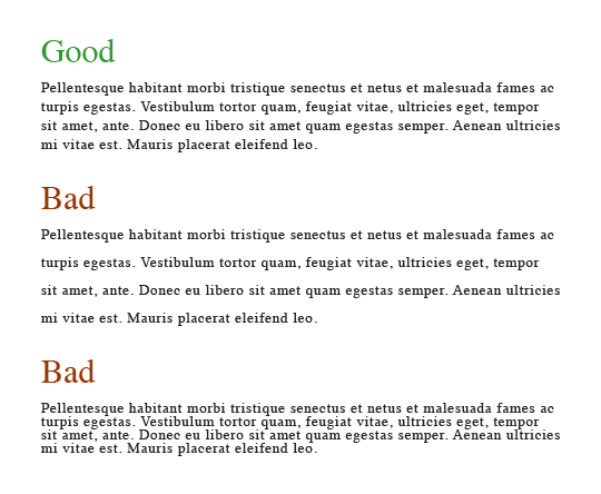
To signal a clear relationship between body and header, generous line spacing has to be ensured. Too tight spacing of body and header might create congestion and the reader loses his or her interest. Whereas, too much white spaces are also not a good practice. Significant amount of blank space might come across and missing text and occupy more space. Text will seem uneven and left out. This is not a good typography practice and one should be careful about the amount of space to be given.

Final Thought
Optimising typography is the key to enhancing reader interest. This essentially means that user interface with the website will improve at an significant rate. This is one element that can’t be overlooked as it would cause more harm to the website, then any badly written article. By saying this, I am not promoting the use of bad content, but specifying the important of optimized typography in web design. While designing a website, if you are in any doubt, do test all the features to make sure that the one you are using will enhance the legibility of the website.
Besides the above factors, a web designer has to be aware about the need of the customer and target audience. Some people are adamant on using animations, However, these are some of the obsolete ways to design website. A proper typography will ensure that your website looks clean, crisp and polished.


